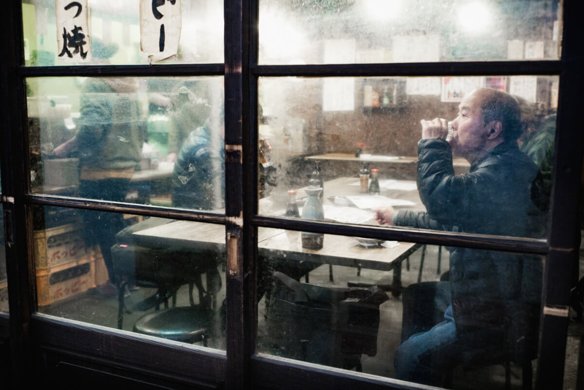
In February of last year, I took this photo of a man enjoying a quiet sake or two just a few metres from the hustle and bustle of noisy Ueno. At the time, black and white seemed to work best. A look I’m still very happy with. But recently, when re-evaluating The Drinkers section of my portfolio, I decided to see how it looked in colour. Like similar experiments with a Shinto priest and a young woman feeding a pigeon in an alleyway, the results are interesting, if not always conclusive.
The Priest portrait I now prefer in colour. No doubt about it whatsoever. The woman in the alleyway depends on what mood I’m in when I see it. And with this one I can’t make my mind up at all. There’s an extra warmth to the colour image that I like. It makes the man seem more content. At the same time, however, the more ageless element of the photo is lost somewhat.
What is for certain is that I got very lucky with the shot. Shortly after taking it, those wonderfully grubby windows were scrubbed clean. And sadly, with the grime went a considerable amount of the bar’s character.

Denton says
So cool! Its color all the way for me. I think it makes the scene loads more positive. 🙂
Lee says
Cheers. Yeah, I know what you mean. A lot warmer, and so a lot more inviting/positive.
Coli says
I think I prefer the color better as well. If it weren’t for his attire and the earphone, I wouldn’t know what era this picture was from!:) classy and timeless in my opinion:) great!
Lee says
Thanks!
Those coats are such a giveaway aren’t they? Luckily this one is a dark colour, rather than a garish green or yellow!
cdilla says
It’s an interesting difference. The black and white focuses the eye more on the mans face – it is appears better lit and everything else is more subdued. The colour one has my eye jumping to the reds and yellows.
For the mood – the black and white.
For the scene itself the colour one.
When I take a photo mostly what I’m interested in is preserving as much detail in the form my eyes see it as possible. But when I see photographs like yours they are a piece of art and not a mere record. The timing, content, parameters, framing and any post production are deliberately selected and executed to create a particular result. Even between these two you seem to have adjusted the perpendicular by a smidge in addition to reinstating the colour.
Lee says
I think that’s why I went with monochrome in the first place. It was the man who initially drew my attention, so I wanted his face to be the centre of attention. As an added extra, the bright lights and dirty glass also seemed suited to black and white.
Agree with the mood element too. And yet as mentioned above, colour does make it feel warmer. All very interesting.
That’s really kind of you. Very flattering indeed. Sometimes when I see or take a shot I know how I want it to look, but that’s definitely not the case every time. Far from it. Especially so as a lot of them have to be taken very quickly. Post-production of course is different, although I keep things nice and simple so at to maintain a sense of reality, and to allow the various imperfections to remain. Life isn’t anywhere near perfect, so I’m very happy to keep the photos that way too.
Harry says
I’m a big fan of both. My kinda place for sure. It’s so tough to choose, but color I guess…..
Lee says
Thanks. That does seem to be the general consensus. The more I look at it, the more I seem to think the same too.
YTSL says
My two cents: the black and white shot looks more “classic” but the color version looks warmer and happier. I think the artistically, I prefer the black and white shot but vibe-wise, I prefer the color photo. Either way, it’s worth more than just one look! 🙂
Lee says
Thanks! I think that sums it up very nicely. Definitely a lot more inviting in colour. And if my memory is correct, that’s probably a more accurate interpretation of the scene I saw.
MrSatyre says
I have quite a few pics of my own which I save side-by-side in their original color, and in various shades of grey. Most of them I still can’t make up my mind which I prefer.
Lee says
Not always a straight, easy choice, is it? I suppose that’s one of the beauties of digital, you don’t have to choose one or the other. And like you said, it’s just as simple to have both.