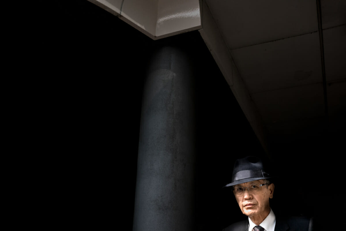
The Japanese salary man is an ever-present sight in Tokyo, and yet due to his incredibly conformist attire, he is also largely invisible. At least as an individual he is, anyway. The simple addition of a trilby, on the other hand, changes that completely.

John says
Really cool shot. I also agree 100% about the hat!
Lee says
Thanks. Quite the look, isn’t it?
Harry says
Awesome moment. He looks more like a gangster than an average office guy! 😉
Lee says
Cheers. Yes, definitely more sinister looking than your average office worker!
YTSL says
The Japanese seem to wear hats more than other nationalities, and wear them well!
Lee says
Yes, they really do. All kinds of hats for all kinds of ages. And like you said, all worn well too.
Coli says
Nicely done Lee! I especially like how the shadow is almost creeping around and wrapping itself around his neck. How far away from him were you?
Lee says
Cheers! Yeah, me too. Got him just at the right time. I’d pre-focused waiting for him to come into the light, and my preferred distance is 1.5 metres. Reasonably close, but far enough away to allow for some context.
john says
I like the image geometry very much on this. The odd thing for me is that the grey tiles at the top don’t look like colour in this image,
nor do they look B/W in mono. It seems like some strange lustre. The light must have been rather challenging here!
Lee says
I really like the geometry of it too. All fits together nicely.
Yeah, those tiles are much more white in real life, but that’s how they came out of the camera. A combination, I presume, of them being in the shade, and me exposing for the much brigter light the man was walking into.
john says
Thanks for the info Lee! I would never have noticed without viewing it in mono.
Lee says
No problem at all. To be honest, the moment I took the photo I imagined it in monochrome. The shadows and the hat all seemed like the perfect fit. But surprisingly it looked way better in colour.
Rohan Gillett says
Great pic! But I don’t know which is better, this one or another you published a few weeks ago of the younger guy wearing glasses. Hard choice …
Lee says
Thank you. Yes, very similar, in a different way!
The other one is exposed much better and there’s a bit more dynamism, but that said, I prefer the look of the man in this one. So ideally I’d combine the two!
Evan says
Very nice! I think this one belongs in the album.
The framing is great, but this moment of his expression adds the most depth for me. Do you take a series of shots in these situations or a single one that just happens to have such good timing?
Lee says
Thanks a lot! Happy with how it worked out, especially his expression and eye contact. Like you, that was key for me.
Always just one shot. My camera isn’t the fastest when it comes to multiple shots, and anyway, there’s only that one moment when they hit the light. Sometimes I get it, sometimes I don’t, but always nice when I do!