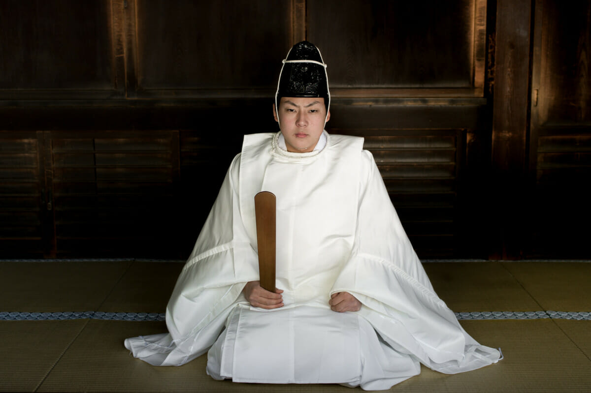
Recently, when putting together a set of traditional Japan images, I went back to the photograph of this intense looking Shinto priest from December 2012. A portrait that at the time seemed much better suited to black and white.
Now, however, I’m not nearly so convinced. In fact, if pushed to pick one or the other, I’d probably opt for colour.

MrSatyre says
I do a lot of architecture photography when I travel, and I’m always torn between b&w, and color. Color almost always wins, however, because I keep finding myself drawn to the subtle-to-dramatic changes in hue.
Lee says
Yeah, I know what you mean. While I’m still really drawn to black and white photography, I find I’m now much more keen to produce images in colour.
Denton says
Gotta say the color version works better for me. It’s more striking. A shot I really like! 🙂
Lee says
Cheers! Likewise, I’m definitely fonder of the ‘new’ version. Somehow it feels more honest if that makes any sense at all.
Evan says
The color is more engaging, to me.
I wonder what this would look like in color: https://leechapman.photos/the-traditional/ahkg06r9tcaygimzt27e6ho0s1ffc2
Would the bandage distract, or add more “color” to the image? And is that a split lip?
Lee says
I actually edited that one again in colour at the same time as this one. Was a toss up which one I preferred, but in the end the intense stare at the camera swung it. Just like you perfectly summed up this version, in colour it was more engaging too. And happy to say the bandage adds to the image. No split lip though. Or at least I don’t think it is.
Will likely add them both to my portfolio soon. Been back numerous times since in the hope of getting more shots, but never seen him again. In fact I haven’t seen anyone. A real shame, as it’d be great to get a series of different priests. Or just this one priest over time.
kikuhouse (Joanna) says
I love this one in colour….it is much more moving than the black and white version, less detached.
Lee says
Cheers. Good to hear. And less detached is a very interesting description. Makes total sense too.
cdilla says
I prefer the colour version. The aged wood is more detailed in colour and the hands look odd in black and white. On the other hand the robe – which has the lion’s share of the scene – looks better in black and white.
Black and white has always fascinated me. It was all that was available to me when I first had a camera, a bellows one my Dad handed down to me, and the developing and enlarging was something I could do. But later, when colour took over, it struck me that before photography was invented, no-one had ever “seen” in black and white before, and that realization made me appreciate, and miss, black and white more. Especially during the bleak 70’s and 80’s before photoshop gave us all black and white at the click of a button.
Lee says
Likewise. The more times I look at it, the more convinced I now am that color is the most effective. But yeah, regardless of this particular image, black and white is something that really appeals to me as well. Most of the photo books I own are in monochrome, and a good amount of photos I enjoy looking at are black and white too.